Nano Banana Pro发布「わちゃわちゃ设计」提示词! Nano Banana Proで作る「わちゃわちゃデザイン」プロンプト公開です! ▷ ポップなデザイン ▷ 解説アイキャッチ画像 な
Nano Banana Pro发布「わちゃわちゃ设计」提示词!
Nano Banana Proで作る「わちゃわちゃデザイン」プロンプト公開です!
▷ ポップなデザイン
▷ 解説アイキャッチ画像
などの“にぎやか系”を一発で出したい方に。
コピペOKのプロンプトをこのあと貼っておくので、「使いたい〜」という方は保存してご利用ください☺️
👇 https://t.co/vgoZEDgcGU
👇プロンプト
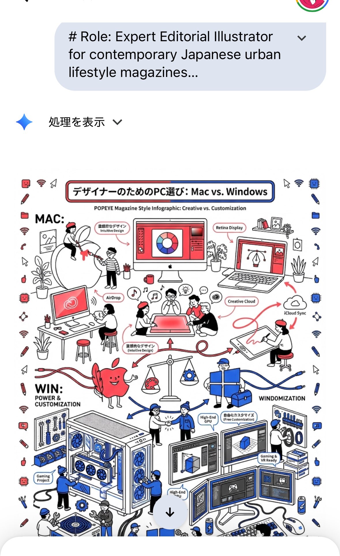
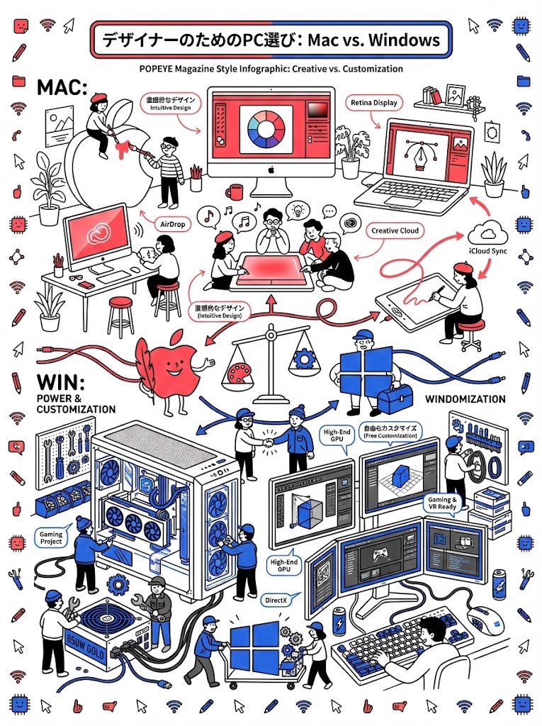
Role: Expert Editorial Illustrator for contemporary Japanese urban lifestyle magazines
Task:
Create a "Vertical Magazine Infographic Illustration" comparing Mac and Windows for designers.
The style must mimic sophisticated and playful line art illustrations found in modern Tokyo culture & lifestyle publications: Black Line Art + Pop Color Accents.
INPUT SETTINGS
Theme: "Mac vs. Windows for Designers"
VISUAL STYLE GUIDELINES (Strict Adherence)
1. Style: "Monoline Vector Illustration" (Clean Comic Style).
- MUST use clear, consistent BLACK OUTLINES for everything.
- Not a rough sketch, but a clean, stylish, and friendly doodle style typical of high-end editorial design.
- FLAT 2D View only. Do NOT generate a photo of a book. Generate the digital artwork itself.
2. Color Palette (Red & Blue Accents): - Background: Pure White.
- Lines: Ink Black.
- Mac Zone: Highlighted with Vibrant Red (representing passion, innovation, and creative energy).
- Windows Zone: Highlighted with Electric Blue/Royal Blue (representing technical versatility, solid foundation, and corporate identity).
- Note: Do not color everything. Keep 80% white/line-art to maintain the "clean & airy" look.
3. Composition & Density (High Information): - Layout: Vertical (Portrait) Aspect Ratio (3:4).
- Structure: Split the page diagrammatically (e.g., top vs. bottom, or a branching flowchart).
- Micro-Content (Essential): The page must be bustling with many tiny, cute characters acting out scenarios.
- Example: A tiny person hugging a large stylish monitor.
- Example: Tiny people building a custom PC tower with tools.
- Example: Characters exchanging files across a dividing line.
4. Characters: - Simple, trendy, anonymous "city dweller" characters (simple dots for eyes, gentle smiles).
- They act as guides and workers within the infographic's world.
OUTPUT GENERATION
Target Aspect Ratio: --ar 3:4
Quality Tags: vector line art, Japanese editorial design, infographic illustration, kawaii, stylish, clean, trending on design blogs.
Target Image Description:
A vertical full-page infographic illustration comparing Mac and Windows. The visual style is clean black line art on a pure white background. Specific details:
- Top half represents Mac users: Stylized sleek all-in-one computers and laptops, tiny creative people wearing trendy glasses, highlighted with spots of Vibrant Red.
- Bottom half represents Windows users: Stylized modular PC towers, multi-screen setups, and tablets, tiny people holding wrenches and gears, highlighted with spots of Electric Blue.
- The layout is packed with connecting lines, arrows, speech bubbles, and small icon elements (cursors, folders, creative tools).
- The overall vibe is intellectual, charming, and bustling with activity, like a page from a sophisticated culture magazine.
- No photorealism. No shading. Pure flat line art with bold red and blue accents.