使用 HTML +CSS 的骨架屏幕加载动画
预加载
使用 HTML 和 CSS 为骨架屏幕加载动画覆盖图像
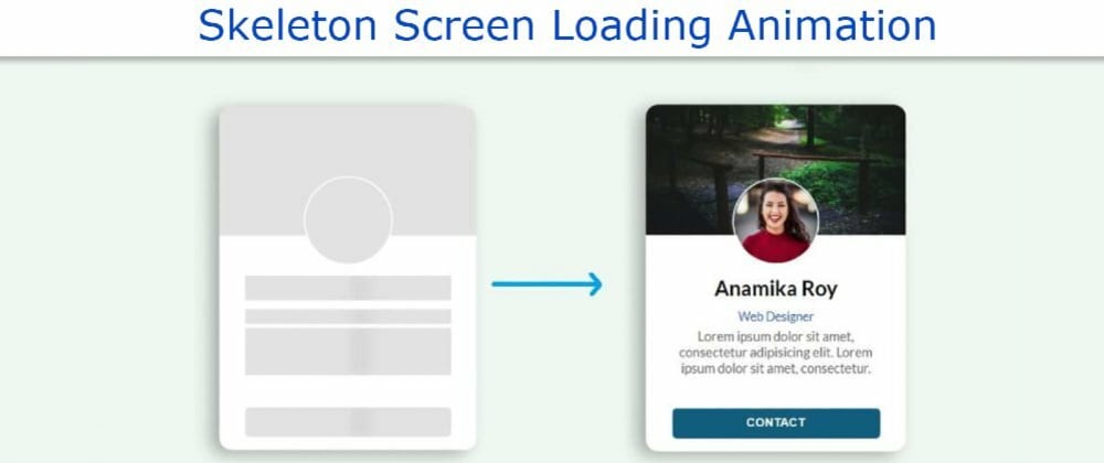
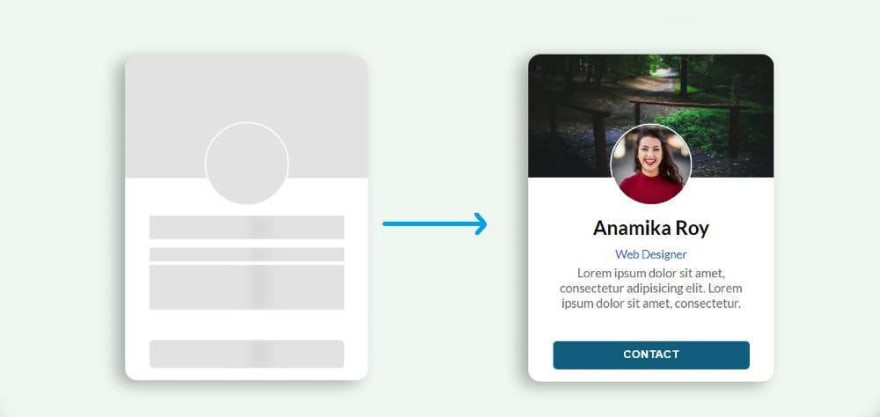
在本文中,我展示了如何使用 HTML CSS 和 JavaScript 创建骷髅屏幕加载动画。我在个人资料卡上创建了此动画。
您将看到各种网站,在那里你可以看到骷髅加载动画之前加载任何元素。毫无疑问,它提高了网站的质量和美感很多。您需要有一个关于 HTML 和 CSS 的基本想法才能做到这一点。
了解其工作原理。我以前已经表现出这种效果,但效果不佳。在这种情况下, 我用 JavaScript 使它工作。
打开网页时,此骷髅屏幕加载动画将持续三秒钟。三秒钟后,此效果关闭,并可以看到配置文件卡上的所有信息。
第 1 步:设计网页
为了创建此动画,我首先设计了带有 CSS 代码的网页。在这里,我用浅蓝色作为网页的背景颜色。
|
|

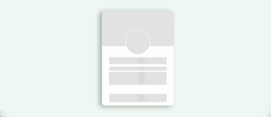
第 2 步:骨架装载的基本结构
现在,我已经创建了此骨架加载动画或配置文件卡的基本结构。我已经使用过这张个人资料卡和这张个人资料卡。卡片周围已经使用了阴影来增强美感。width: 300px``height: 400px
|
|
|
|
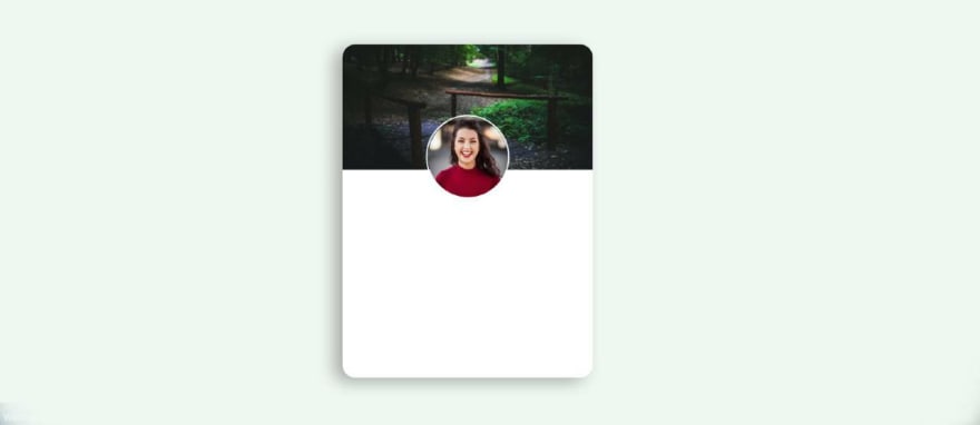
第 3 步:添加配置文件图像和封面图像
现在,我在个人资料卡中添加了个人资料图像和封面图像。我使用配置文件图像的宽度和高度 100 px。我曾经让它完全圆。我添加了封面图像和宽度: 100%。border-radius: 50%``height: 150px
<div class="user-cover">
   <img class="user-avatar" src="img.jpg" alt="user profile image" />
</div>
|
|
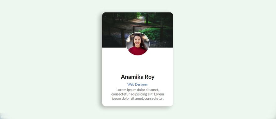
第 4 步:向卡片添加基本信息
现在,我已经添加了一些基本信息在这个骷髅屏幕加载动画或配置文件卡。我使用保证金顶部:35px 来保持所有信息从上到下。
<div class="user-details">
   <div class="user-name hide-text">Anamika Roy</div>
   <div class="user-email hide-text">Web Designer</div>
   <div class="user-text hide-text">Lorem ipsum ... consectetur. </div>
</div>
.user-card .user-details {
  text-align: center;
  margin-top: 35px;
  margin-bottom: 25px;
  width: 80%;
}

.user-card .user-details .user-name {
  margin-bottom: 10px;
  font-size: 24px;
  font-weight: 600;
}

.user-card .user-details .user-email {
  font-size: 14px;
  color: #0f5fc0;
  font-weight: 500;
}
.user-card .user-details .user-text{
  margin-top: 5px;
  font-size: 15px;
  color: #666;
}
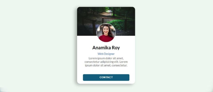
第 5 步:创建联系人按钮
现在我已经在其中添加了一个联系按钮。我已经用过按钮,背景颜色是蓝色的。我用字体重量:大胆增加文本的大小。height: 35px``width 60%
<button class="contact-user hide-text">CONTACT</button>
.user-card .contact-user {
  margin-bottom: 15px;
  height: 35px;
  width: 80%;
  border: 0;
  color: white;
  font-weight: bold;
  background: #035f7d;
  letter-spacing: 0.5px;
  border-radius: 5px;
  cursor: pointer;
}
第 5 步:将加载效果添加到图像中
首先,我在个人资料图像和封面图像之间添加了动画。但是,图像中没有动画,只有我在后台使用了灰色。我设计个人资料图像和封面图像的方式和我在这里设计它的方式是一样的。
.user-card.skeleton .user-cover {
  background: #e2e2e2;
}

.user-card.skeleton .user-cover .user-avatar {
  display: none;
}

.user-card.skeleton .user-cover::after {
  content: "";
  position: absolute;
  width: 100px;
  height: 100px;
  border-radius: 50%;
  left: 0;
  right: 0;
  margin: auto;
  bottom: -35px;
  border: 2px solid #fff;
  z-index: 10;
  background: #e2e2e2;
}
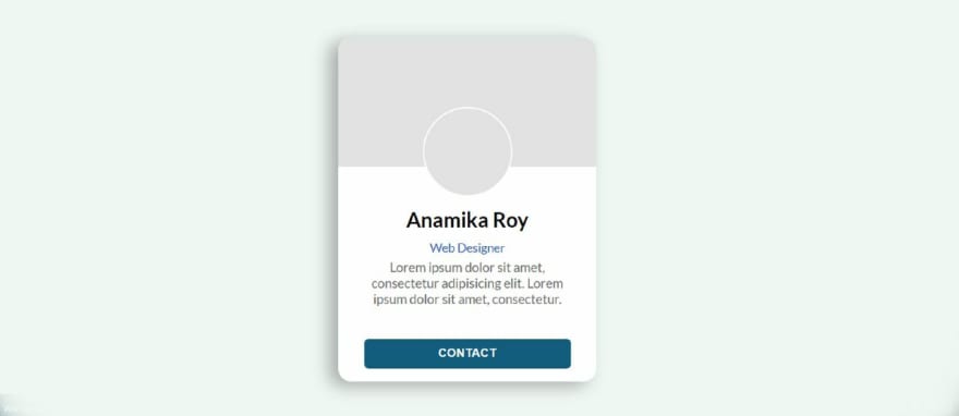
第 6 步:向信息添加加载效果
现在我在文本和按钮之间添加了动画和颜色。首先,我添加颜色的按钮和文本,然后我添加动画使用。@keyframes
animation-duration: 2s用于帮助使此动画每两秒钟工作一次。在这里,动画意味着黑色阴影将继续从左到右每2秒传播一次。
.user-card.skeleton .hide-text {
  background: #e2e2e2;
  color: transparent;
  position: relative;
  overflow: hidden;
}

.user-card.skeleton .hide-text::before {
  content: "";
  position: absolute;
  left: 0%;
  top: 0;
  height: 100%;
  width: 50px;
  background: linear-gradient(to right, #e2e2e2 25%, #d5d5d5 50%, #e2e2e2 100%);
  animation-name: gradient-animation;
  animation-duration: 2s;
  animation-iteration-count: infinite;
  filter: blur(5px);
}
现在我已经使用@keyframes实现了这个动画。
@keyframes gradient-animation {
  from {
    left: 0%;
  }
  to {
    left: 100%;
  }
}
第 7 步:使用 JavaScript 关闭骨架加载效果
现在最重要的是关闭使用 JavaScript 的动画。上面我们增加了骷髅屏幕加载动画使用 css。
此动画将无限期地继续。因此,现在使用 JavaScript 一段时间后,您必须关闭该动画并指示查看配置文件卡中的所有信息。我把使用时间定在3000毫秒。这意味着之后,灰色动画将被隐藏。setTimeout``3000 milliseconds
如果你想使用4秒而不是这3秒,那么你必须在这里使用4000而不是3000。
const $el = document.querySelector(".user-card");

// Loading finished
setTimeout(() => {
  $el.classList.remove("skeleton");
  $el
    .querySelectorAll(".hide-text")
    .forEach((el) => el.classList.remove("hide-text"));
}, 3000);
- 原文作者:知识铺
- 原文链接:https://index.zshipu.com/geek/post/css/%E4%BD%BF%E7%94%A8-HTML-+CSS-%E7%9A%84%E9%AA%A8%E6%9E%B6%E5%B1%8F%E5%B9%95%E5%8A%A0%E8%BD%BD%E5%8A%A8%E7%94%BB/
- 版权声明:本作品采用知识共享署名-非商业性使用-禁止演绎 4.0 国际许可协议进行许可,非商业转载请注明出处(作者,原文链接),商业转载请联系作者获得授权。
- 免责声明:本页面内容均来源于站内编辑发布,部分信息来源互联网,并不意味着本站赞同其观点或者证实其内容的真实性,如涉及版权等问题,请立即联系客服进行更改或删除,保证您的合法权益。转载请注明来源,欢迎对文章中的引用来源进行考证,欢迎指出任何有错误或不够清晰的表达。也可以邮件至 sblig@126.com